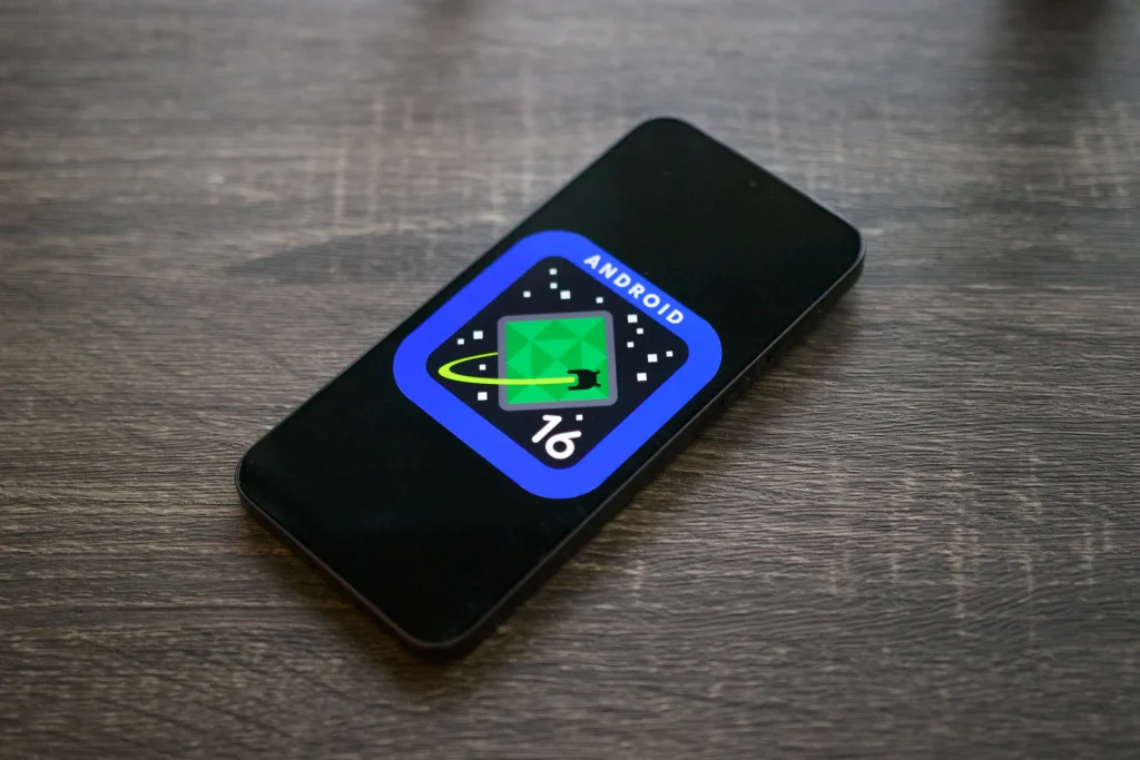
Android 16 Developer Beta Redesigns Volume Panel and Slider
Google’s Android 16 Developer Beta is here, and it’s bringing some notable changes to the user interface, particularly in how volume controls work. The volume panel and slider has been given a big makeover — all the way from the looks to the controls to make it sleeker and more refined, in line with Material Design 3 guidelines. The intent of this update is to provide a simpler user experience and, more importantly, add precision to the volume adjustment.
The thick, pill-shaped sliders of Android 15 are gone. In their place, the Android 16 Developer Beta introduces thinner, streamlined sliders with more defined handles. This tidies up the interface while promising to simplify how users set volume levels to greater accuracy.
A Closer Look at the Redesigned Volume Controls
The most apparent update in the Android 16 Developer Beta is the volume slider’s transformation. However, the new design does a 180 in the way that the slider is displayed; we now have a slimmer, rectangular slider which has a more minimalist look. All this has resulted in moving the icon showing the current volume stream to the bottom of the slider, and changing the three dots that expand full volume panel to be smaller and less obtrusive.
The goal here is to give people a bit more precise control. This thinner sliders allow a higher degree of granular volume adjustments as you can find the exact or close to the perfect level for audio playback. Right now, we’ll see if this improves the overall user experience and Google seems to be experimenting with how to make volume control fresh, but nothing is yet proven.

Does the New Design Improve Usability?
While the changes in the Android 16 Developer Beta seem promising on paper, not everyone is convinced they’re an improvement. If you like the playful spirit of Material Design, the current Android 15 volume controls are there for you – bold and colorful. As opposed to that, the new minimalist approach might sound too generic or not as special as Google’s devices takes care of Pixels.
Of course, it’s a Google product, and the redesign is in keeping with Google’s larger mission to make its products cleaner and more modern. The thinner sliders and repositioned elements remove columns of elements from the volume panel, making the entire panel look less cluttered if you’re the kind of user who prefers no fuss over grand, visual spectacles.

How Does It Compare to Previous Versions?
While Google’s volume controls in Android 15 worked, their thick, sliding sliders took up lots of screen space. The Android 16 Developer Beta addresses this by slimming down the sliders and rearranging the layout for a more compact look. This means that the new design is less intrusive when messing around with volume for other things.
But some users might be missing the older design’s personality. Android 15 was specifically decorated with chunky sliders and vibrant colours, which set the interface in its own unique shape. The new design is cleaner, but trades some of this personality for a minimalist look.

Final Thought
The Android 16 Developer Beta is setting the stage for a more polished and precise user interface. The redesigned volume panel and slider are cleaner and more modern looking, but not to everyone’s taste. If you are a fan of the design of previous Android versions but are looking for something a little more bold and playful with your Android experience, then the new aesthetic might be a bit too subdued for your taste.
However, Google is certainly going to shift the Android experience, and the changes reflect that. By focusing on usability and simplicity, the Android 16 Developer Beta aims to strike a balance between functionality and style. The new design isn’t bringing to your screen, just like the original concept, whether or not the new design will become a fan favorite is something we may never know, though one things for sure, Google isn’t done pushing the boundary of mobile interface design.
How these changes evolve in the beta, as it progresses, will be interesting to see how users respond. The redesigned volume panel is a small, but important step in the ongoing refinement of Android user experience.


